2.8 Exploring Data
There are many ways to explore the dataset in Momentum. We will perform a few of them to illustrate the functionality of Momentum. Launch the exploration page by clicking “Data Upload and Exploration” located at the top of the left hand-side menu panel. Here are the steps of data exploration:
Exploring Data, Types and Distribution
To understand the data types and column-wise distribution, the steps are:
- Expand the data source, e.g., Ingester Output and select the ingester data you want to explore.
- Click “Explore Data” located at the top menu bar.
- In the next page, the column wise data distribution will display.
- The result shows the data type, total count, number of nulls, min, max, average, and standard deviation of each column.
A sample data exploration result is shown in Figure 1.12 below. Similarly, data created by other components, such as transformer, machine learning, or NLP, can be explored.

Figure 2.12 : Data exploration result
Viewing and Analyzing Data
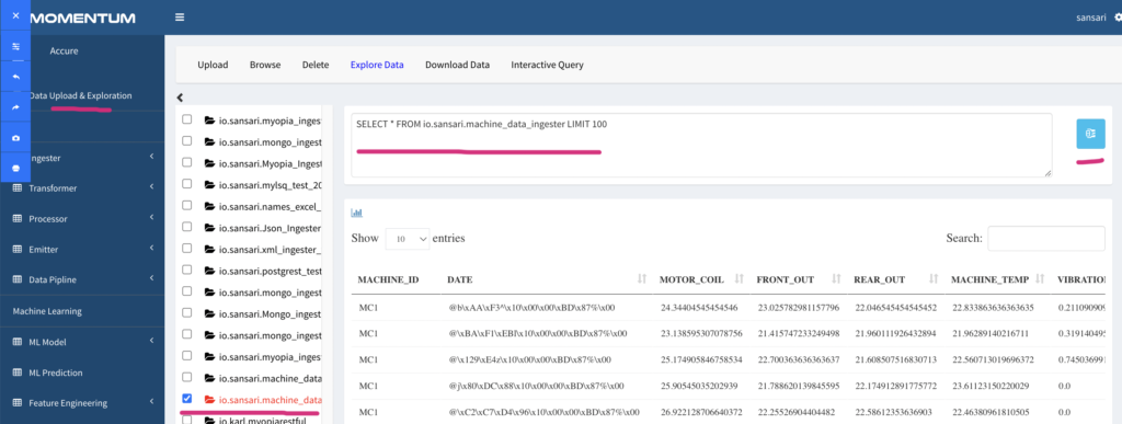
Expand the output components, e.g. the “Ingester Output” and click the data component (e.g ingester) you want to explore. This will show 100 records of the data. To show more rows, edit the SQL query shown in the text area and click the ‘blue button’ next to it to run the updated SQL. For example, changing the LIMIT 200 will show 200 rows, ‘LIMIT all’ will show all the data (‘Limit all’ may crash your browser if there is a lot of data). The following Figure 2.13 shows the SQL and data rows.

Figure 2.13: Data view and corresponding SQL
Alternatively, you can use Interactive Query to perform ad hoc analysis as described below.
Ad hoc Analysis Using Interactive Query
Interactive Query is a powerful data exploration tool that allows you to execute any ANSI-SQL compliant query over data available within Momentum.
Data within Momentum is organized within the component that generates them. The organization structure is analogous to RDBMS structure in the sense that component name is treated as a database and data generated from various sources as tables of that database. For example, Ingester generated data are organized within “Ingester Output” aliased as “io”. The data tables within the Ingester Output are referenced using fully qualified name as “io.<username>.<tablename>”.
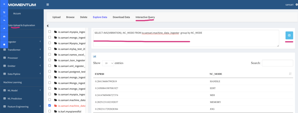
For example: to explore the machine data to count number of records by Machine_failure, we run the following Interactive Query as shown in Figure 2.14 below.
SELECT AVG(VIBRATION), NC_MODE FROM io.ai.cnc_historical_data GROUP BY NC_MODE
Listing 1: Sample SQL statement to count by Machine_failure

Figure 2.14: Example Interactive Query with sample output
Visual Analysis
Visual analysis allows us to plot data to understand the data distribution, outliers, trend, and overall quality of the data. To perform visual analysis, click on “Data Upload & Exploration” and do the following:
- Expand, for example, “Ingester Output”, click on the ingester you want to analyze.
- It will show 100 rows of data. You will notice a graph icon at the top of the query result section (as shown in Figure 2.15 below).
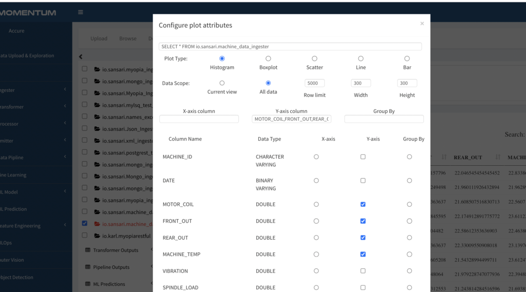
- Clicking on the graph icon will launch a modal window to configure your graph.
Figure 2.15 Red circle to indicate the graph icon to launch the plot configuration window.

Figure 2.16: Config example for plotting histogram

Figure 2.17: An example output of histogram plots
Downloading Data for Offline Exploration
- Expand, for example, “Ingester Output” or any other component that generated data, select the data you wish to download
- Click “Download Data” located at the top menu bar.
- The data will be downloaded in the format it was originally created, default being the parquet format.
Note that, depending on the amount of data, it may take a while to generate and download the data from the cluster’s distributed lake to your local computer.